


So here is my sculptie in Second Life

I decided gardens are like beautiful gifts back to the landscape and to the public. So I found a website of 13 beautiful gardens around the world:
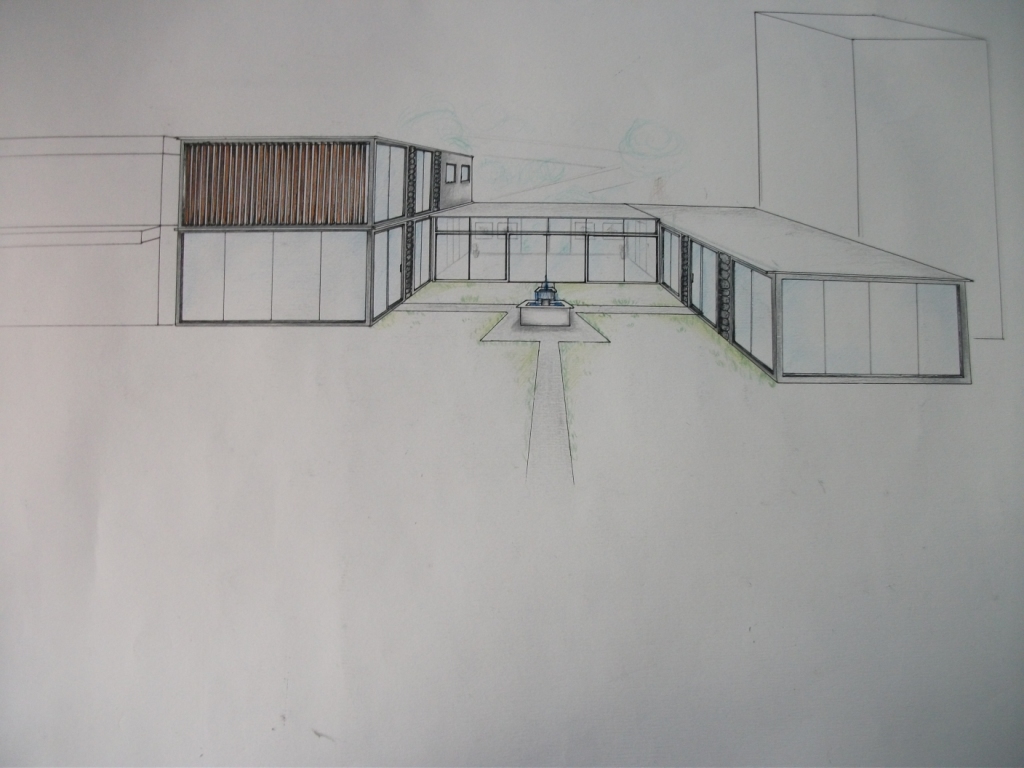
This is my building so far in SL:

left wing:

right wing:

My idea of gifting would be a gift for the public. The gift is an open foyer, which exhibits projects that my architectural firm has worked on. The public will be able to see what this office has been up to, and will be able to walk through the foyer and to the other side of the building; like in my previous project.
I think I will also keep my original idea of a courtyard/garden area for the public. The garden also acts as a gift for the public; it is a visual gift.
The foyer looks like this at the moment. I think I'll add a screen that displays the works this firm has worked on. Only office workers are able to access into the office areas through the glass doors with an access card.

I added an elevator that takes people up to the foyer, public and office people are both allowed in the foyer.

26 sept:

I got rid of my elevator that brings people up to the foyer. My tutor suggested that I link the front of my building to the rear of the building so the public can really get a sense of 'walking through' the building; because my main idea of gifting was a foyer and courtyard area that was open to the public and displays for them to see, and because there is a walkway at the rear side of my building and I didn't want to block it off from the public.

My movement for gifting is the forward sweeping motion of the pictures on display for the public to see. When you say "hi" the pictures will move towards you.


Sept 27:
I decided to add a deck, because the right wing and left wing of the building is supposed to be linked to the courtyard in the middle. The deck acts as like a transition space between the outside and the inside of the building. All around the interior facades, large window panes cover the surface. This is so that everything point in the direction of the courtyard, as it is the centrepiece of my office building. I have also added a fountain, because my last project consisted of a fountain as the centre of the courtyard, which was also related to my augamented reality 1:1 model of the experience of being able to hear the sound of water running nearby.

These are the steps I added to the front of the building...I changed to stairs rather than the elevator going up into the foyer. This was because I wanted everything to link, from walking up the steps to through the courtyard, then through the foyer and to the other side. Having the steps instead also meant that you could already see the courtyard up there. It feels more open, as this transition space is for the public as well as office workers.So this is what my steps look like when idle:

I scripted the stairs so that when you say 'stairs', they will come out at you and you can walk up to the courtyard. My original idea was for them to all come out of the top prim (as if all would come out of the same prim) in a downward then forward motion one at a time, like the steps were welcoming you and inviting you to come up. However, when I did the scripting, the prims would only move for a maximum of 10m...so the steps did not move how I would have liked them to. I was also hard because the lower you go down the stair, the steeper the slope of the land was, therefore I required more and more prims.This is what my steps look like what they've positioned themselves into place for the avatar.

Sept 28: Final design
So here are my final steps, I decided to change the texture of them to match the grass in the courtyard so that everything links.

My fountain...
Since my courtyard is supposed to be my main idea of gifting to the public, I added flowers to make it look more elegant.

Inside the right wing:
Here is the space for the architect and engineer. They required similar office equipment which is why I have grouped them together in the same room. Here you can see the drawing board for the architect and the storage for safety equipment when they go on site.
The workshop for model making, and the bathroom.

This is the view from the other end of the courtyard (looking towards the stairs).

Inside left wing:
There is an elevator to the right, couches in the middle for when meeting clients, and a tv on the left wall.

The tv turns on when you say "tv". It is of my animation.


This is the view looking up from the foyer where the couches are. I decided to make it so that you could see up because I wanted the downstairs to relate to the upstairs. Similarly why I made my elevator out of glass inside.

This is when you first exit the elevator upstairs:


The bathroom, kitchen and through the glass door is the conference room.

Inside the conference room

Large windows for a great view outside

And this is what my building looks like overall


Compared to this from my last project:
So to some up my concept:
My idea for gifting in my office building is the courtyard and foyer sitting in between the two wings of my building, acting as a gift to the public. In the foyer are displays of project my architecture firm has worked on, and a lovely fountain sitting in the middle of the courtyard. The steps that lead you up to the office building at the front move towards you on demand, as if welcoming you and inviting you to come through. At the top of the steps is the main courtyard area where the fountain is. Office workers can also cross through the courtyard from the left wing to the right or vice versa through the sliding doors on the interior facades of the building. All the windows are facing inwards to the courtyard. This is because the courtyard is the centre of my whole office building. The decks I have added because they link the inside spaces to the outside spaces. Through the courtyard and into the foyer are where the display of projects are. When an avatar says ‘hi’, they will move towards them. The foyer is open overhead rather than having a closed roof because I wanted the public to not feel intimidated from being under our roof when coming to see our work. After the open foyer is the other side of the building. All the outside areas are link so the public can easily access through and walk to the back side of my building. There is a walkway behind my building at my site, so public can walk through easily to get to the walkway.
My Matrix:

Peer Review
The group we reviewed today did augmented reality. The people I reviewed were:
Her idea was to make a building that was wrapped up in white fabric. She got here inspiration from the Millennium Dome. I liked how her building had different rooms with different functions, but the whole building was wrapped up in white cloth so it all seemed as one big mysterious building. This made all the rooms in her building connect. I thought it was mysterious because the form of the structure was visible through the white cloth, but you couldn't actually see anything, and this made me want to go inside. It was great how you could actually go inside her model. Her structure reminded me of a tensile structure. Overall I liked her 1:1 model because it was unique and mysterious.
What I really like about his building was that there were stairs that go up the hill in the park, and that the public could use the flat roofs of his office building as public space. What I think he could have added was grass on some of the roofs so his building blended in with the surroundings more. This is because I think having an office building sit in the middle of a park might be a bit sore to the eye.

She wasn't here for the crit, but I went on her tumblr page to have a look at what she got up to. It was quite difficult to tell what her concept were because there was no information on it. But this is her final project I'm assuming:

The people who reviewed me were


