Wednesday, 24 August 2011

Week 6-7 Gathering (Animation)

For these few weeks, we will be gathering information to build upon a design for a building. My design group will be working on some drawings and produce an animation as a result.


The 5 people who will be working in my architecture firm include:
1. An Architect (me)
Requires: drawing board, desk, computer, workshop for model making, place to store files.

2. A Structural Engineer - we will rely on him to do all the technical stuff, and he will sometimes go on site to see the construction.
Requires: Computer, possibly a drawing board, desk, computer, filing cabinet, safety equipment for site visiting.

3. Construction Manager - overseas the projects, makes plans, contacts the clients, builders and suppliers. Will often go on site to see projects etc.
Requires: Computer, desk, computer, filing cabinet, safety equipment for site visiting, telephone.

4. Accountant - Makes sure we keep within our budget, calculate expenditure. Deals with the clients, bank and suppliers.
Requires: Computer, desk, computer, filing cabinet.

5. Marketing Director - The public figure, advertises our firm, ensures our business develops.
Requires: Computer, desk, computer, telephone, files.

The site I have chosen is Te Taou Reserve, which is beside the old Railway Station.

An influence in my design will be the convent is France by Le Corbusier: it encloses a courtyard area, similar to how Te Taou Reserve is enclosed, except it is enclosed by roads and building.


In the end, I though putting a building in a reserve was not such a good idea, so I decided to have it opposite Te Taou reserve instead, and just add a courtyard area enclosed within the building.


One of the criteria was to have all the services needed within a 10 minute walk from the office building. Because my colleagues will most often be working in the office and occasionally at the construction site, not that many services are required. However, the 10 minute walk radius encompasses an ASB bank, Kalmar Construction, a post box, a children care centre and a cafe just to name some examples.


The problem with putting my office building here is that it blocks off the walkway from the main road to Anzac Avenue. Therefore I have made a section of my building to be accessible to the public. They can walk through the foyer of the office building to get to the other side. Staff in the architecture firm also uses the same entrance, however upon entering the foyer, the have a special access card that will get them into the building. The courtyard area enclosed also acts as a threshold for the people working in the office. It is a different transition space to what one would normally see, as it is incorporating the outside and natural environment.


I then drew a bubble diagram of the rooms that are to be in the building such as the rooms for work, the workshop, conferene room, bathrooms etc.
To incorporate my previous work into this project:


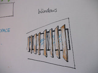
My fountain for my awakening project was made completely out of concrete. Therefore for this office building, the main material will be concrete. In the middle of my courtyard will be a fountain. My second project, the repair stall, was made out of wood. For that project I wanted to investigate the pattern the light makes when it enters through the gaps in each second piece of wood. I will incoporate this by having outdoor blinds for some of the windows.


The draft of my building looks like this at the moment.

After seeing my tutor today, I received some helpful advice. It was to make my building more 'contemporary looking' and less domestic by having larger window panes on the front facades, and a more contemporary looking fountain rather than adapting the one I did in my awakening project.

 Here is a new design of the fountain I came up with:

My tutor also got me thinking about the interior of the foyer. Rather than leaving it as an empty space simply for people to walk through, I thought I would design for it to have displays of projects that the architectural firm has completed up on the walls.


I came up with some rough plans of how the layout of my office building might look like...

...and decided to add a footpath so people wont have to walk on the grass.

Then I came up with my final plan of the layout for the ground floor...
 and the first floor.
Sectional drawing:
Lastly, final design:

Finally....my animation!


My matrix:


Peer Crit 3:

Vasilije
What I like most about his offic was that it was like a continous journey, you could walk over from one area to another on the planks and that was an interesting transition space. There were lots of connecting spaces, and what I like about his project was that he utilised other people's walls/prims and integrated it into his own design. He really thought about what his 5 colleagues would need in his offic and this is evident from the interior design. For example the light channels that point downwards for the artist, and the viewing area of the train tracks for the engineer. It seems he really evaluated his work throughout the whole project and came up with better ideas in his final design.

Ye Jin
I really liked how she used many scripts to make objects in her office move, such as the table that expands, and having walls move so that the space can be a private area/open area. Her matrix building was one by Mies van der Rohe, and she used the idea of heaving a floating building. I also liked how each storey had one specific function/use. The objects she traded were interesting and decorative. Her design was simple, but suited the purpose. She chose a good site for her office, and really though about it in context.

Yumeng (Angela) Feng
Her matrix building was the Dymaxion House. Her main idea was in the simplicity of her building, because the main idea was to use the least amount of material to create a greater area of space within. Her other idea for gathering was to have the flame in the middle, I liked the use of the flame as the centrepiece in her office, because it has this attractive quality, like people gathering around a fireplace. She really though about the people who were in her office and the space they were to occupy; for example, for someone who like privacy she had a wall that could move to create an internal space for privacy.

The 3 people who reviewed my work were:
Huicheng (Emily) Wu
Louis Ratana
Jian Xiang (Mickey) Ma 

Tuesday, 16 August 2011

Week 4-5 Sustenance (Laser Cutting)

For weeks 4 and 5, our group did laser cutting. We had to develop a design for a market stall in the car park by the old Railway Station, which was part of our site. The stall had to somehow relate to sustenance. I chose to design a violin repair stall because the violin for me is what sustains me in a way. I love playing it and violin music. I thought that a repair stall would be more relevant rather than having a stall that sells violins because repairing a violin is maintaining its physical form and bringing it back to its original state as much as possible so that it can perform at its best again. Similarly with the human body, we have to maintain out physical health to keep us going and to perform at our best. Sometimes we even have to undergo surgery, and that is in a way 'repairing' our body.
 The wood grain on a violin before it is painted and varnished looks like this. I was interested in the pattern the wood grains made and wanted to reproduce the effect by cutting strips on paper and letting light through.


 I tried to develop it a bit further by adding some ornamentation and an edge to it....


The are many curves on the violin such as the f holes, the srcoll, the bridge.... pretty much the whole body of the violin.


I didn't think that idea was very good because the front of the stall did not compliment the body.

A violin is hollow on the inside. I decided to give the structure more volume. The back of the stall is going to be an area set aside for the luthier to work on the repairs. The back of the stall will be closed off, and only for the luthier. The front of the stall will be where the counter is and will be open to customers. The front of the stall can be used to sell small accessories like shoulder rests, bridges, strings, metronomes, cleaners and violin necessities.

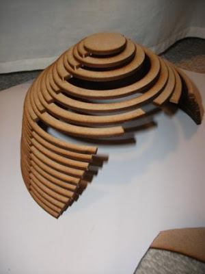
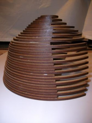
I still wanted to incorporate the interesting pattern, so every second arch that makes up my structure is slightly shorter which allows for the light to enter. This means the back of the stall, which is the workshop area, will still be closed off from the outside to allow for the conditions needed in a violin workshop. I decided to make lots of arches and stack them on top of each other, because I really wanted to emphasise the curve of each arch and the pattern for the light entering the stall.


Violins are stained with colour which covers the original colour of the wood. Likewise the laser cutter made a very nice brown stain on the edges where the cuts have been made.


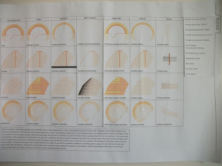
Matrix

Peer Crit 2:

William Brooks.
The word that his project was developed around was 'eventmental'. He defined this as having an experience with a room. He design two contrasting rooms on the top storey of an apartment building that alters with the acoustics of sound. I think he developed his design fairly well and the building supports its function. He also worked with the interior of the building such as the use of materials to alter the acoustics. I thought that was a really interesting idea having two contrasting rooms, and his final animation was good.

Xinran Chen.
Her big word was phenomenology, architecture-wise it is based on the experience of building materials and their sensory properties. She wanted to create an architecture that sustains us, but also focus on an experience or sense. She specifically wanted to create a new experience for people in wheelchairs, which was a supermarket with super wide isles. Other people do not have to deal with issues such as not being able to reach or getting stuck in isles in supermarket. I think her planning supports the function, because she designed the shelves to be low enough for people in wheelchairs to reach. It was also in a very convenient site because there was a bus stop nearby, and they could just do their shopping then get on the bus and return home.

Xiang (John) He.
His main idea for his project was love. I liked the way he though about the use of colour in this situation. I liked how he experimented and did a lot of brainstorming on the topic of love, and though about how it can relate to architecture. He wanted to design an architecture that would remind people of love, however I though the final design of the top part of a heart was a little too literal, and I was a little confused about where the cheese came into this. The site he chose was interesting because it bridged between commercial buildings on one side an residential buildings on the other. I liked how he tried to used bright colours to represent vibrance and bubbly feeling of when you're in love, however in this context of urban industrial buildings it may have been a little to colourful.

The 3 people who reviewed me were:
Ji Sun Lee
Jung Ah Kim
Joseph (Ivrel) Kagaoan

Wednesday, 3 August 2011

Week 2-3 Augmented Reality


For week 2 and 3 our group did augmented drawings of a place we would like to wake up in. I chose this area:


I chose this as my site because I particularly liked the sound of the running water in the pond.

For my design, I wanted to base it on listening to the sound of running water and being able to feel the flow of water during my awakening. My bed is almost like a concrete boat, which is open at the top because I wanted to emphasise the experience of being outdoors while lying in bed.
I decided to place a fountain at the head of the bed so when I'm lying down I can hear the water nearby. There is also a water channel running down the right hand side of the bed that water from the fountain flows into. The water channel is open at the foot of the bed, allowing a continuous flow of water from the fountain through the channel and out into the pond again. When I wake up in the morning I want to be able to feel the running water and wash my face from it etc because it feels refreshing.
I decided on using concrete as my material for my whole design, because there are big boulders on one side of the bed. In order so blend in with the natural surroundings, I have used curved edges and made it out of concrete which corresponds to the nearby boulders.


My matrix of my whole bed

Peer review 1

Xiang (David) Li.
His main ides for his light was focused on internal reflection and having light rays come at you. When he held it up to the light, I could actually see some internal reflection happening in the perspex. His project worked with both the interior and exterior. I though his choice of site was a little odd because I was on the side of a building and it wasn't high enough so people wouldn't walk into it, and it wasn't low enough to be sitting on the ground. I like how he uses refraction and reflection of the light to produce an effect that otherwise could not be produced without the model. This one is my favourite image of his. I guess his design was successful in producing the effect of light rays coming at you, because I really get a sense of that when looking at the model from the bottom/top.

Weiwei Kong.
Her main idea was to show the shadow of the city. She didn't really talk about it being a light, because she wanted to show the real city itself, superimposed. It was almost like a silhouette of the city. She worked well with the laser cutting and took advantage of the engraving technique. I like the final assemblage, because the randomly fixed, changeable and irregular form was a great reference to the shadows we see in real life.

Yi Heng (Damien) He.
His project was to project light from inside and out in order to attract pedestrians. What I saw were 3 boxes, one inside another. Each had slits that limited the amount of light entering through, and interior space. I liked the idea of limiting the light because it really made me think of how I would be curious and would want to go inside to have a look if I was a pedestrian walking by. He found an artist model, Tadao Ando, who's architectural work had similar concepts to his own project. I think this was really helpful for him in developing his ideas. The 3 boxes sit on the ground, and I think it suits the function. The final product was attractive, and if I was a pedestrian I would definitely want to go inside and have a look.

The 3 people who reviewed my work were:
Jimin Jun
Joyce Kwong