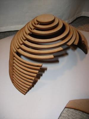
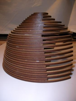
For weeks 4 and 5, our group did laser cutting. We had to develop a design for a market stall in the car park by the old Railway Station, which was part of our site. The stall had to somehow relate to sustenance. I chose to design a violin repair stall because the violin for me is what sustains me in a way. I love playing it and violin music. I thought that a repair stall would be more relevant rather than having a stall that sells violins because repairing a violin is maintaining its physical form and bringing it back to its original state as much as possible so that it can perform at its best again. Similarly with the human body, we have to maintain out physical health to keep us going and to perform at our best. Sometimes we even have to undergo surgery, and that is in a way 'repairing' our body.
The wood grain on a violin before it is painted and varnished looks like this. I was interested in the pattern the wood grains made and wanted to reproduce the effect by cutting strips on paper and letting light through.
I tried to develop it a bit further by adding some ornamentation and an edge to it....
The are many curves on the violin such as the f holes, the srcoll, the bridge.... pretty much the whole body of the violin.
I didn't think that idea was very good because the front of the stall did not compliment the body.
A violin is hollow on the inside. I decided to give the structure more volume. The back of the stall is going to be an area set aside for the luthier to work on the repairs. The back of the stall will be closed off, and only for the luthier. The front of the stall will be where the counter is and will be open to customers. The front of the stall can be used to sell small accessories like shoulder rests, bridges, strings, metronomes, cleaners and violin necessities.
I still wanted to incorporate the interesting pattern, so every second arch that makes up my structure is slightly shorter which allows for the light to enter. This means the back of the stall, which is the workshop area, will still be closed off from the outside to allow for the conditions needed in a violin workshop. I decided to make lots of arches and stack them on top of each other, because I really wanted to emphasise the curve of each arch and the pattern for the light entering the stall.
Violins are stained with colour which covers the original colour of the wood. Likewise the laser cutter made a very nice brown stain on the edges where the cuts have been made.
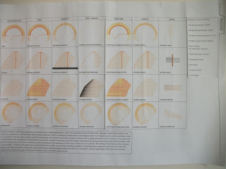
Matrix
Peer Crit 2:
William Brooks.
The word that his project was developed around was 'eventmental'. He defined this as having an experience with a room. He design two contrasting rooms on the top storey of an apartment building that alters with the acoustics of sound. I think he developed his design fairly well and the building supports its function. He also worked with the interior of the building such as the use of materials to alter the acoustics. I thought that was a really interesting idea having two contrasting rooms, and his final animation was good.
Xinran Chen.
Her big word was phenomenology, architecture-wise it is based on the experience of building materials and their sensory properties. She wanted to create an architecture that sustains us, but also focus on an experience or sense. She specifically wanted to create a new experience for people in wheelchairs, which was a supermarket with super wide isles. Other people do not have to deal with issues such as not being able to reach or getting stuck in isles in supermarket. I think her planning supports the function, because she designed the shelves to be low enough for people in wheelchairs to reach. It was also in a very convenient site because there was a bus stop nearby, and they could just do their shopping then get on the bus and return home.
Xiang (John) He.
His main idea for his project was love. I liked the way he though about the use of colour in this situation. I liked how he experimented and did a lot of brainstorming on the topic of love, and though about how it can relate to architecture. He wanted to design an architecture that would remind people of love, however I though the final design of the top part of a heart was a little too literal, and I was a little confused about where the cheese came into this. The site he chose was interesting because it bridged between commercial buildings on one side an residential buildings on the other. I liked how he tried to used bright colours to represent vibrance and bubbly feeling of when you're in love, however in this context of urban industrial buildings it may have been a little to colourful.
The 3 people who reviewed me were:
Ji Sun Lee
Jung Ah Kim
Joseph (Ivrel) Kagaoan


No comments:
Post a Comment